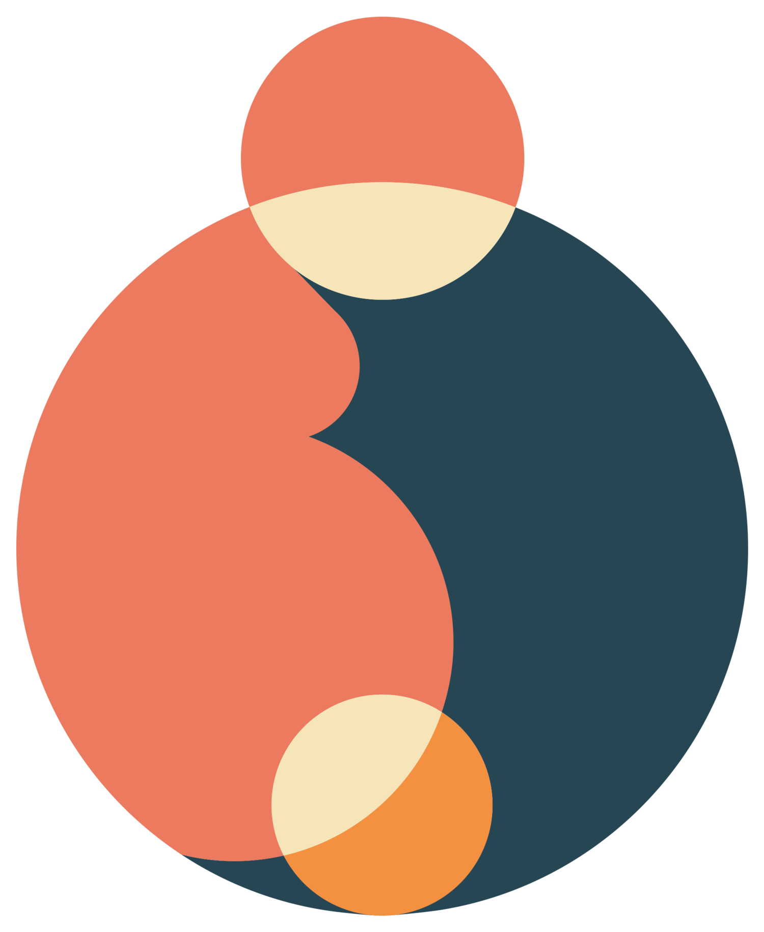
Logo-tastic!
Look at it! It is so shiny and beautiful and new! Mental Push Plan logo… you’re a REAL peach.
The Process
We are not graphic designers. Luckily, we have a friend who is an incredibly talented one - Nick Trahan. We had little to no experience in what the creative process of designing a logo was like, but we sure found out! Thankfully, Nick was very kind and generous in leading us through the process. Never once did he roll his eyes, though all of our calls were voice only, so maybe there were a few. ;)
It started with us giving Nick very little to go on other than our name and colors. His sleuthing of our website turned up a few other gems. There was back and forth over what colors to put where, whether to include lettering, and if that baby being halfway out of mom was a good look (turns out, it is). We are ever so thankful that Nick brought his A game and also pushed us a bit out of our comfort zone to settle on a final design that we all think is fantastic.
What struck us the most with the process is how much it requires you to dig in to who you are and what you stand for as a company. Your logo is one of the first things people see and, hopefully, they come to know you by it alone. It’s not just something that looks good, though it should do that too, but it has to smack ya in the face with This. Is. Who. We. Are. It’s gotta give you all the feels. So, who are we? What are our feels?
The Inspiration
We are Mental Push Plan. We are two people who had babies and realized there just isn’t enough mental preparation support for labor and birth. Bringing life into this world is an awesome responsibility, but it’s tough too. It can be a sprint or a marathon or, heck, even an ultramarathon! People giving birth deserve the respect and dignity of getting the best of the best. They are elite. So, we decided to create these elite-level mental tools, and put them to the best use we can think of - birthing babies.
The Meaning
Our logo demonstrates this by prominently featuring the birthing person. It is from, with and through this body that life comes into the world, which is a BIG deal. Their head is bowed as we often do when concentrating hard and harnessing focus. It’s a sign of turning inward and mustering all your mental strength in the immense physical sensations of birth.
The shape of the birthing person as part of the circle was meant to create a yin-yang aesthetic. Yin-yang is a concept of dualism. That two seemingly opposite forces (light & dark, sun & moon, male & female) actually complement each other and make up all aspects of life. This couldn’t be more true for pregnancy, childbirth and parenthood. Excitement and fear, pain and elation, celebration and grief are feelings all parents must balance in the journey of creating, birthing and raising a child.
Finally, the baby. Oh, that baby! It would have been easy to just feature the birthing person and call it a day. But birth ain’t easy. We are deeply committed to the ultimate mental push that goes hand-in-hand with the physical push. The crowning of your baby’s head is… well, it’s so many things. It’s difficult, painful, exhausting, elating, sobering, awe-inspiring and un-freakin’-believable! It is one of those moments in life that you didn’t know if you could handle, but then you did and it makes you feel incredibly powerful. We aren’t shy about waxing poetic about these moments that we get to experience as birthing people and our logo isn’t either.
A note from Nick on the logo creation process (remember, he’s the one who really knows what he’s talking about) -
“The overall circular shape centers the relationship of the mother's mind to her body, through life's most important period of time (creation, development, delivery). The inner circles highlight key parts of that process, while the alignment of smaller circles help focus the connection of mind to body to baby.
Minimalistic, abstract, modern. Soft shapes and soothing natural tones inspired by the initial concept and overall brand look. The silhouette curvature helps illustrate strength, fertility and femininity. The division/separation of the shapes represents balance, duality, and how forces interrelate. The use of negative space helps to indicate faces and provide human perspective.”
Our logo is both a tribute to all that birthing bodies do and a promise that we’ll help you get your mind ready to really labor and birth like a CHAMP!
Mwah!
Carolyn & Lauren


